Peak Demand? RMI: Peaking, a Theory of Rapid Transition
How Patterns of Peak, Plateau, and Decline Point to Fossil Fuels’ Accelerating End
By Kingsmill Bond, Sam Butler-Sloss
THE PEAKING SERIES – 1. THEORY
The Peaking Series is a new series mapping the vast mountain range of past and current peaks in fossil fuel demand. In country after country, sector after sector, fossil fuel demand has peaked and now faces a future of decline. This report develops a new framework, The Peak, Plateau, and Decline, to chart the shape of change; subsequent reports will show how this story is playing out in key sectors and regions of the world, from cars to electricity, from the United States to China.
1. EXECUTIVE SUMMARY
The endgame is here. In one country and region after another, demand for fossil fuels is facing inevitable decline. This report sets out the framing for why and how this happens and explains the irreversible pattern of peak, plateau, and decline. Subsequent reports will look in more detail at past, present, and future peaks.
The rapid growth of new energy technologies is the primary driver of system change. Falling costs and superior performance lie behind their S-curves of change.
The current energy crisis is speeding up change. High fossil fuel prices and energy security fears will only encourage more efficiency and more renewables.
Globally, energy demand is expanding slowly. In such a low-growth system, the rapid rise of new energy technologies inevitably means declining demand for old fossil fuels.
The Peak, Plateau, Decline Shape
However, systems are complex. Incumbents fight back, cyclicality creates noise, existing stocks support demand. The result is that fossil fuel demand tends to follow a peak, plateau, and decline pattern.
When does the peak happen? The timing of fossil fuel peaks depends mainly on the overall growth rate of the system and the growth rate of the new energy technology. Peaks tend to happen early in the transition, when fossil fuels are still dominant, and renewables have a market share of 5%–10%.
How long does the plateau last? Depending on the growth rate of energy demand and the growth of new energy technologies, the plateau will tend to last for around a year for discrete items like cars and a decade for systems such as coal or oil.
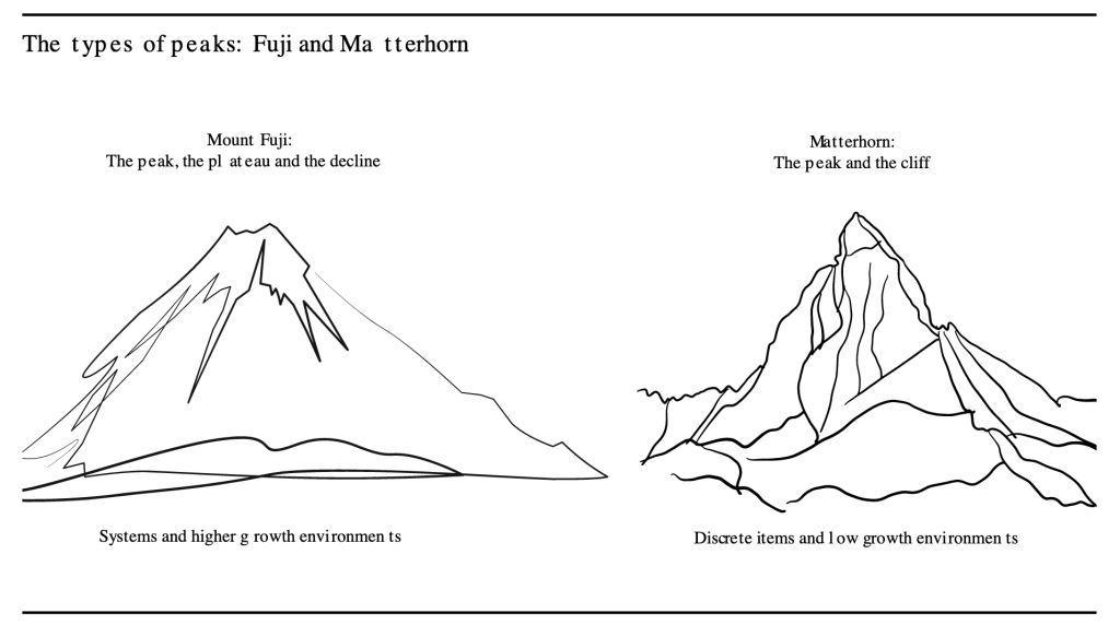
In broad terms there are two types of peaks — the Matterhorn peak, which is sharp and spiky; and the Mount Fuji peak, which has a long plateau. Although peaks usually look and feel long, in retrospect and with perspective they often turn out to have been quite brief.
Conventional Thinking Is Wrong
Energy analysts tend to argue that energy transitions are long, slow, and manageable. This analysis suggests that in fact the peak comes quick and early and is highly disruptive.
2. THE DRIVER OF CHANGE — S-CURVES
The key driver of change in the energy system is the quick growth of new energy technologies. The reason for the growth is usually that the new technology is better and cheaper, so there is a degree of inevitability to the shift once the new technology is proven. The classic historic example is the shift from the horse to the car. The same pattern is now repeating in the shift from the internal combustion engine (ICE) car to the electric car. The standard way to describe this growth of the new is with an S-curve.
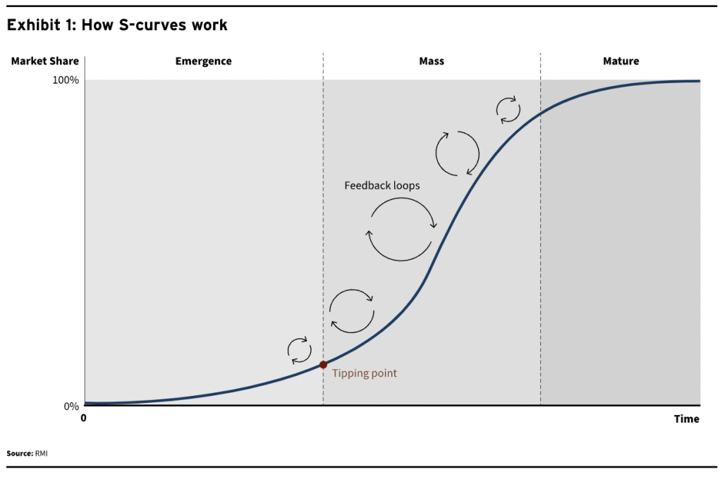
The Three Key Stages of an S-curve
S-curves tend to have three main stages:
- Emergence (innovation): The emergence stage is when ideas are tried and abandoned. Costs fall rapidly. Many companies fail; a few winners emerge. Expertise grows in niches.
- Mass (rapid rollout): In the mass stage, a technology reaches price parity and growth happens rapidly. The tipping point where renewables supply all the growth in energy demand will often take place when they have a market share of just 5%–10%. And this creates a powerful feedback loop for technologies on learning curves, such as solar and wind. Rising volumes drive lower costs; and falling costs drive more demand.
- Mature (system consolidation): Eventually the new technology dominates the market. In this mature stage growth slows rapidly until it reaches the low growth rate of total energy demand.
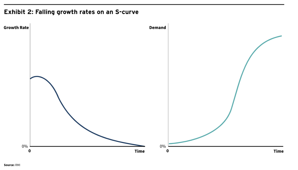
 Even as penetration rises, the percentage growth rate of new technologies tends to decline over time, due simply to the law of large numbers. However, the total deployment continues to rise rapidly.
The Rise to Dominance Is Rapid
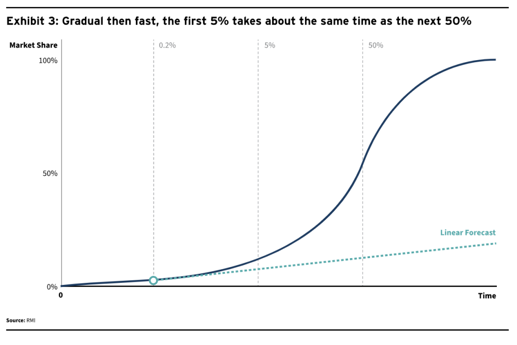
S-curves vary markedly from more conventional linear models. In an S-curve, growth in terms of deployment rises rapidly following the tipping point. It can take the same amount of time to move from a miniscule market share (say 0.2%) to the tipping point of 5% as it takes to rise from 5% to a 50% market share (Exhibit 3).
This characteristic of S-curves often confuses analysts reliant on linear models, which tend to understate growth. Where a conventional model predicts 5% market share, technologies following an S-curve may actually hit 50%.
The reference case of understated growth expectations has been the sustained rise of solar. In 2010, analysts including the IEA predicted that in 2020 the world would be installing 12 GW of solar annually. Instead, in 2020, installations surpassed 135 GW.
Size Matters
When a new technology has a very small market share, even rapid growth rates have little impact on incumbent demand. For example, if a new technology has a 1% market share and is growing at 50%, it will supply only 0.5 percentage points of total additional energy demand.
However, once its market share gets to 10%, then even lower growth rates can absorb all demand growth. If it has for example a market share of 10% and is growing at 20% a year, it will add 2 percentage points of growth; this is a level that exceeds total growth in most low-growth energy systems.
By this calculus, a surging new technology can satisfy all new incremental market growth. In the global electricity system, this dynamic is currently at work: Almost all incremental demand for electricity is already met by renewables.
In practice there will of course be factors which complicate the growth of new technology on an S-curve. But, as a rule, once learning rates and growth rates are established, they are highly likely to continue.
3. THE IMPACT ON INCUMBENT DEMAND
The Theory
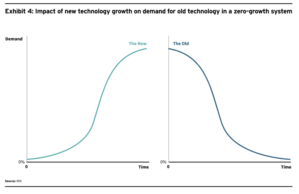
In a two-part system with no overall growth, the fall in demand for incumbent technology is simply the inverse of the growth in new technology.
Complicating Factors
In practice, systems are more complex than this. Some factors will hold back change, while others will speed it up. Factors which can complicate a smooth transition include:
- System growth. If there is overall system growth, then decline in demand for fossil fuels may be obscured for a few years. Because of the high growth rates inherent in S-curves, this period usually will not last long, however. For example, the steady state growth rate of car demand used to be around 3 million new cars a year. EV sales took only 5 years (2015–2020) to grow from 0.5 million to 3 million in sales.
- Other parts of the system. In practice, there are rarely just two parts in a system. In electricity for example, the battle is between solar and wind on the one hand (accounting for about 10% of the global system and growing at 20% per year) and, on the other, fossil fuels (about 60% of the system with growth of below 1%). But other electricity generation technologies — including nuclear, hydro, and biomass (around 30% of the system with growth rates of 2%–3%) — can play an important role in specific markets and specific years. Because growth rates are too low, they do not have a material impact on the long-term story, but they can cause short-term noise.
- Incumbents fight back. Incumbents can of course fight back by reducing prices and improving quality. This is known as the “sailing ship effect” after the fact that sailing ships underwent a rapid boost of innovation in the second half of the nineteenth century in response to the rise of the steamship. This did not save sailing ships from an eventual decline into irrelevance as transporters of heavy freight, but it did enable them to keep competing in niche uses for a couple more decades.
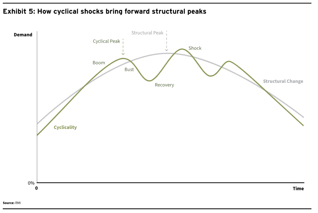
- External shocks. External shocks can introduce cyclicality into the calculation (Exhibit 5). For example, in 2020, the shock of COVID damaged demand for fossil fuels but did not slow down the growth of renewables. That brought forward the peak in demand but means that the plateau will be longer. By increasing the price of fossil fuels, Putin’s invasion of Ukraine is another external shock which is speeding the shift toward renewables.
- New areas of demand. Even as certain sectors and countries decline, it is of course possible for fossil fuels to find new areas of growth. For example, at present, there is still some demand growth for oil in airlines and petrochemicals.
- The Osborne effect. As consumers realize that technology is changing, they hold back from making new purchases.
- Government action. Governments can act to tax fossil fuels for their externality costs. Or they can nudge people to use less fossil fuels. Or, perversely, they can even act to sustain further fossil fuel use.
- Societal change. Societies can shift preferences rapidly, which can in turn bring forward structural change.
- Efficiency. Gains in efficiency can speed up change.
Flows and Stocks
There is a key distinction to be made between flows and stocks, which are linked but different. If we take the car sector for example, flows are annual car sales, while stocks are the total car fleet. Of course, a change in flows will eventually feed into a change in stocks as shown in Exhibit 6.
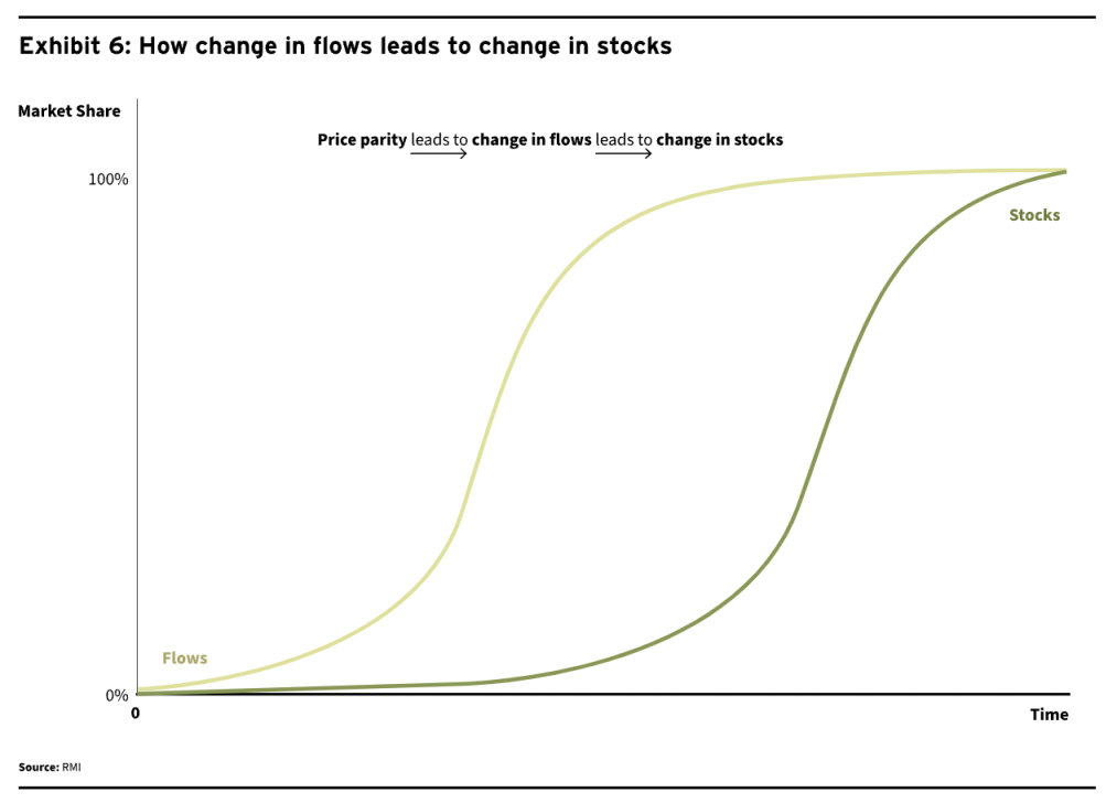
Flows can change quickly but stocks take time to change. However, once the flows have shifted, the change in stocks becomes inevitable.
Energy demand for a system has the characteristics of a stock because it has a huge installed base. We should thus expect the peak for fossil fuel demand to be slower than that for discrete items like ICE cars or gas boilers, but the decline to be inevitable once change has set in.
We illustrate this in Exhibit 7 with cars, using the BNEF NZE scenario framing. EVs take market share of new car sales rapidly. The share of EVs in the global fleet follows more slowly, but inexorably. It is notable that BNEF (and others) have accepted peak ICE car sales (a flow) in 2017 and BNEF forecasts that the ICE fleet (a stock) will peak as early as 2022.
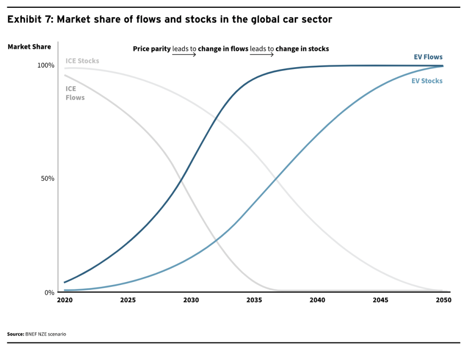
The key factor for determining the peak of stocks then becomes how long an item lasts. The stock of smartphones can change rapidly because people replace their phone once every few years. The stock of cars is replaced every 15 years or so. And the stock of power stations turns over more slowly still, about every 30–40 years.
In Practice – a Peak, Plateau, Decline Shape
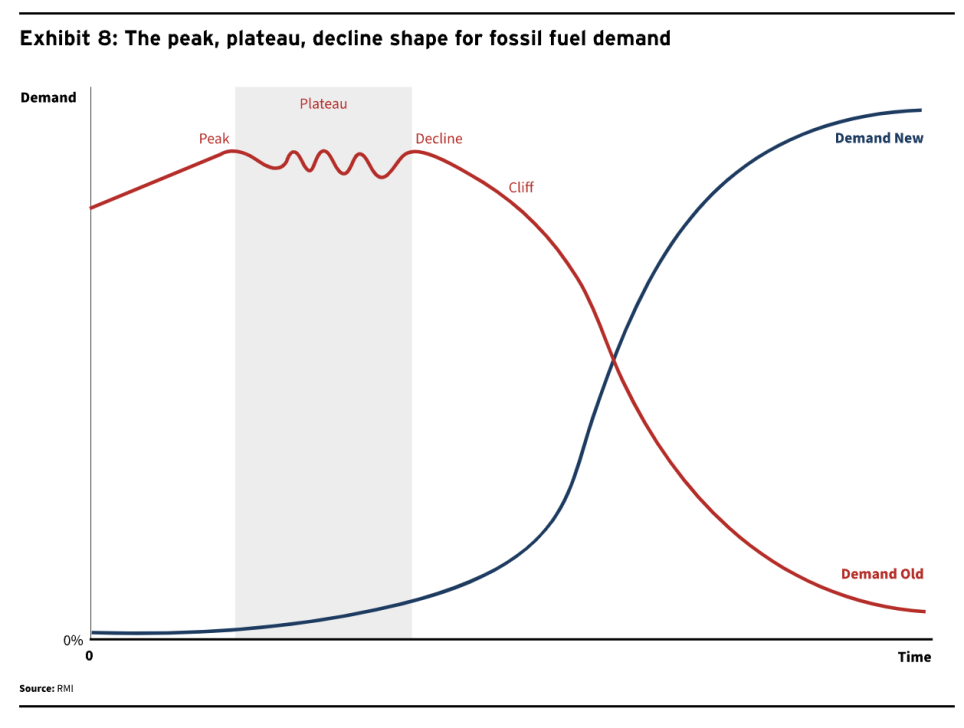
The peak comes due to the structural change and at an early stage. Incumbents rarely see peaks coming. The classic example of this is the US coal sector, which still anticipated growth in 2007 even as demand was about to collapse.
The plateau results from the noise and the fightback of the incumbency. There tends to be a messy and noisy period where incumbents believe that any bounce in demand is the start of a new super cycle and pour their energies into trying to hold back change. It is also worth noting that the cyclicality and external shocks will tend to impact the incumbent technology far more than the challenger. We have seen this clearly in recent years as solar and EVs have continued to grow through COVID and Putin’s War, while fossil fuels suffered the cyclical shocks and recoveries.
The decline. Decline sets in inevitably because of the nature of the growth in an S-curve. As a new technology’s market share rises rapidly after 5%, then all the growth is soon taken by the new system.
Two Types of Peaks: Matterhorn and Fuji
There are two main types of peaks, which we call Mount Fuji and the Matterhorn, given their profiles.
- Fuji peaks are slower and longer. You get a plateau at the top for a few years.
- Matterhorn peaks are quicker and sharper. The plateau is short and is followed by a steep decline.
The Mount Fuji peak
The Fuji peak applies to the following areas of fossil fuel usage and supply:
- Stocks rather than flows. For example, global coal demand or the car fleet.
- High growth systems. For example, Chinese electricity demand.
- Systems with few alternative sources to fossil fuels. For example, air travel.
The Matterhorn peak
The Matterhorn peak will apply to the following areas of fossil fuel usage:
- Discrete items (or flows). For example, iPhones or cars.
- Low growth systems. For example, European electricity.
- Systems with a large non-fossil alternative energy source. For example, aluminum.
The Importance of Perspective
At the moment of change, all systems tend to feel like Mount Fuji — a long grinding plateau. Change is difficult, it is resisted, and people deep in the system often suffer from the “expert’s curse” of not being able to see solutions outside their many decades of experience. Experience in other sectors and technologies indicates that solutions are usually found even if those making the forecasts cannot see them. Global talent is of course widely distributed, and the combination of necessity and large financial rewards often brings results.
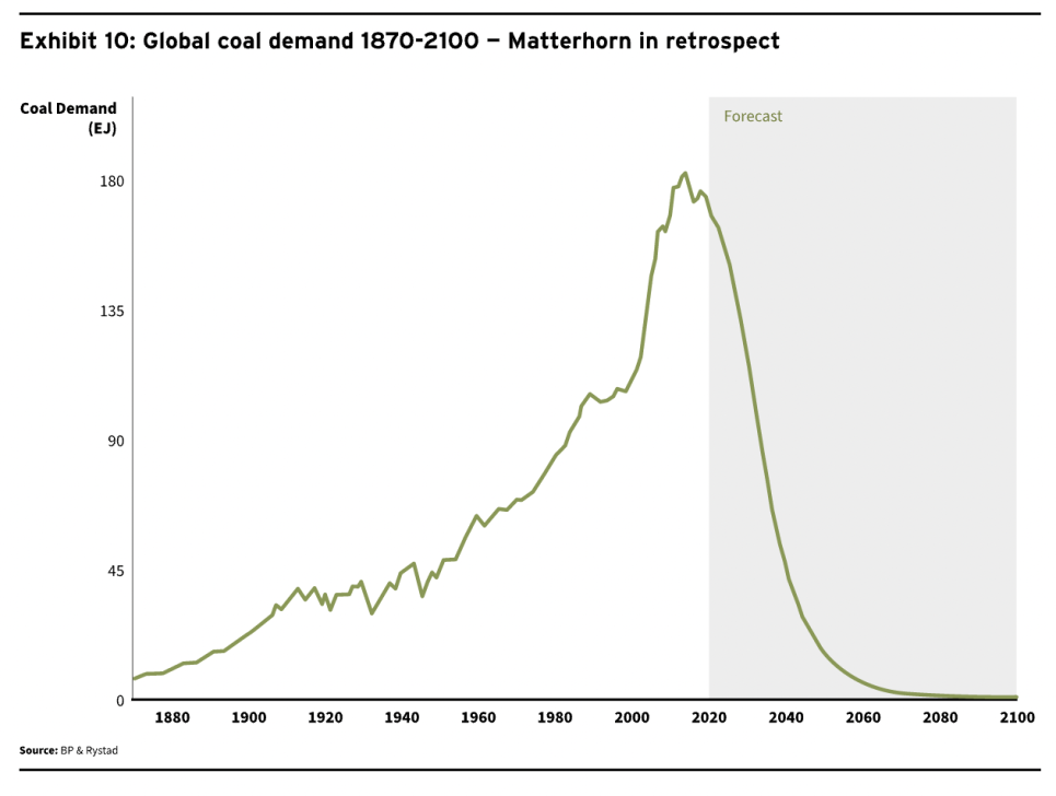
In retrospect and especially over a longer time frame, change often looks like the Matterhorn: a sharper peak, then a rapid decline.
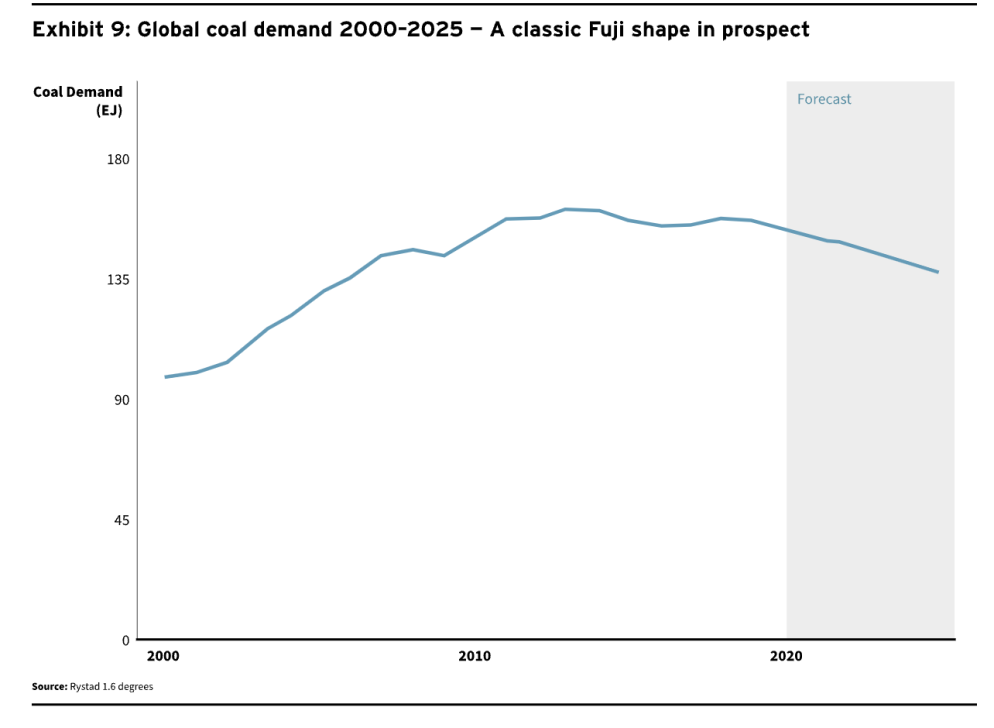
We can illustrate this with global coal demand from 2010–2025 — a classic Fuji shape (Exhibit 9). Demand peaked in 2013, fell a little in 2015, recovered a little in 2018, fell in 2020, and bounced back in 2021, so we expect a plateau of around a decade. Putin’s war may enable that plateau to last for a couple more years of course.
However, if we stand back and look at demand over a longer period, then what seems like a long plateau looks like a sharp peak and decline (Exhibit 10). Future generations will marvel at our lack of foresight if we continue today to build new coal mines and equipment to use coal.
4. TIMING AND DEFINITIONS
There are then five questions on the nature of peaks as they relate to the energy transition:
- How large are renewables at the peak of fossil fuel demand?
- How large are fossil fuels at the peak of their own demand?
- When does the plateau start?
- When does the plateau end?
- How long does the plateau last?
Of course, the answers depend on circumstances. But the broad framing can nevertheless be seen, as we set out below. The key conclusions are that peaks manifest early, and that plateaus are usually quite quick.
How Large Are Renewables at the Peak?
The size of renewables at the peak depends on energy demand and renewable growth rates, as we show in Exhibit 11, which is simply a mathematical calculation. For most systems, renewables will have a market share of between 5% and 10% at the point where they take all demand growth.
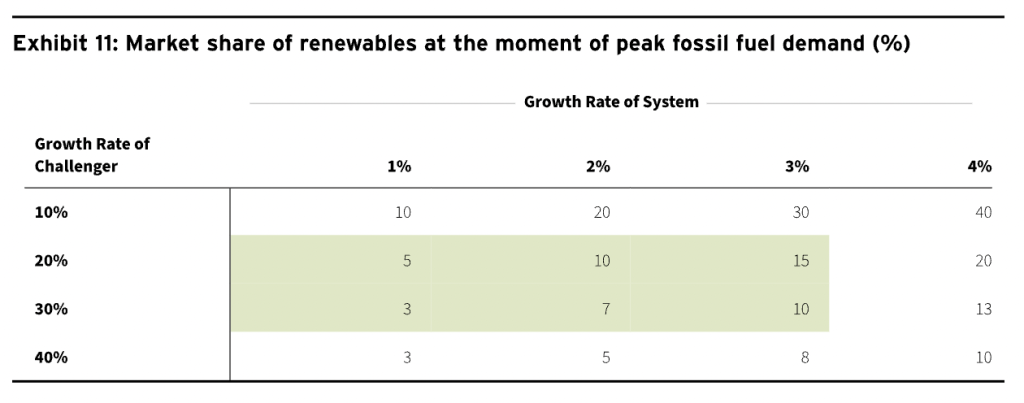
- In a low (1%) growth energy system with rapid renewable growth rates (say 20%), peak fossil fuel demand comes when the renewable technology has a market share of just 5%.
- In a higher growth environment (say 3% energy demand growth), renewables with a 30% growth rate will need a 10% market share to get all the demand growth.
How Large Are Fossil Fuels at the Peak?
Fossil fuel market share is simply the residual in a two-part system. So, in such a system you would expect fossil fuels to have a market share of between 90% and 95% at the moment when demand peaks. In the energy system as a whole, the presence of other sources of supply with a market share of around 15% means that the fossil fuel system at the peak would have a market share of 75%–80%.
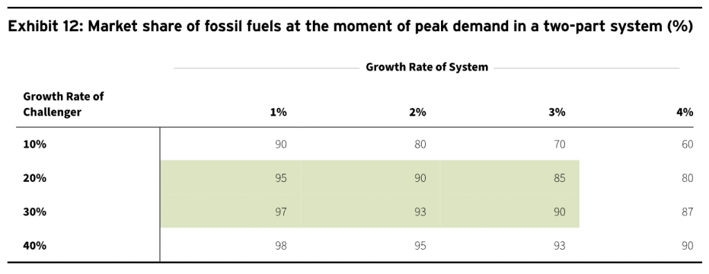
While this is obvious, it is notable how large the market share of the fossil fuel system is at the moment of peak demand. This often takes incumbents by surprise. How can they be facing inexorable decline when they are so large and have so much money and power? The answer is that their size is in fact a source of fragility at moments of technology-led disruptive change.
When Does the Plateau Start?
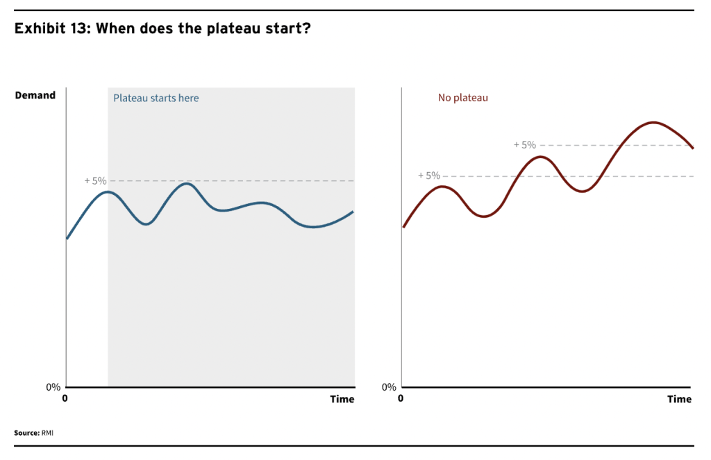
There is no formal definition of what a plateau is, but it is usually clear when you see it. Take for example the first chart in Exhibit 13 of a peak followed by a fall followed by another high point and then a decline. Our observation is that the plateau is reached at the first peak rather than the second high point, which turns out to be a mere bump in a plateau. This is a moderately important framing because many systems do in fact hit a peak and then bounce around for a while; we should realize this is not the prelude to a new burst of growth.
We would suggest that a plateau is reached if a decline has happened, and any subsequent peak is no higher than say 5% more than the previous peak. While there is no strict methodology behind the 5%, given there is no other formal definition, we feel this at least enables analytical consistency.
When Does the Plateau End?
It is also important to ask at what point the plateau itself turns into decline. This is illustrated in the first chart in Exhibit 14.
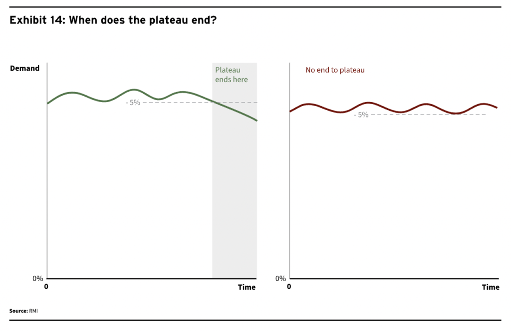
We would suggest that the plateau can be said to end when demand is 5% below the peak level and in decline. Again, 5% is simply chosen as a reasonable level for significance.
How Long Does the Plateau Last?
The length of the plateau depends on energy demand and renewable growth rates as well as the market share of renewables at the moment of the fossil fuel peak, and whether the moment of the peak has been pulled forward by some external cyclical shock.
We set out below a simple framing for the length of the plateau based on the system and challenger growth rates. We assume peak fossil fuel demand has taken place at a 10% market share for renewables. And we are looking for the number of years it subsequently takes for demand for fossil fuels to drop by 5%.
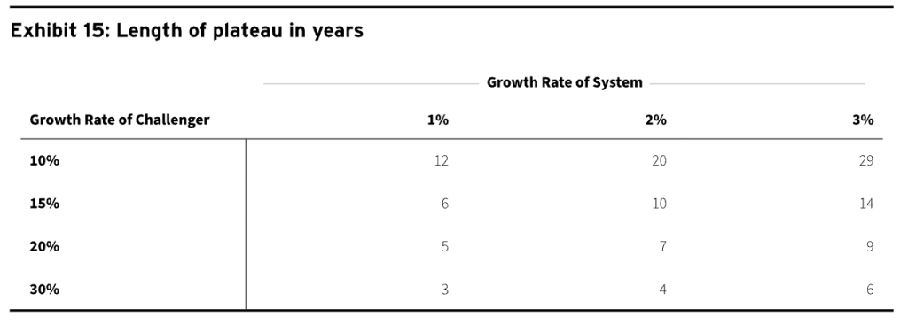 </picture > The plateau can quite easily last for a decade because challengers need to deal with ongoing demand growth and also push down demand for incumbents by 5%. Plateaus can last even longer if the peak has been pulled forward by a couple of years by cyclical factors.
If we distinguish between our two frameworks
In discrete low-growth (Matterhorn) systems, the plateau will last for as little as a year. Examples include car demand or demand for new coal-fired power stations.
In stock-based systems, the plateau can last for a decade, such as in the demand for coal.
CONCLUSIONS AND IMPLICATIONS
The conventional framing for the energy transition is as a long and difficult battle against massive incumbent forces enjoying inevitable growth. Analysts tend to focus on the harder-to-solve sectors and the difficulty of driving change in them.
This note sets out a different perspective. One in which the very size of the fossil fuel system is a vulnerability. Where the driver of change is new technologies on exponential learning curves that will cause an inevitable decline in demand for fossil fuels. Where peaks come early and decline sets in fast. Where the fossil fuel system is already in retreat, and the task is to accelerate change that has already been set in motion.
The gap in perspectives is illustrated by the bounce in demand we saw in 2021 or the current increase in capital expenditure to try to replace Russian supply. The orthodox view sees the bounce in demand in 2021 as the prelude to a new supercycle of growth, and the surge of capital expenditure as a harbinger of a massive increase in fossil fuel demand.
Our perspective would suggest that the bounce in demand in 2021 is simply a bump on the plateau of fossil fuel demand. That the high prices of fossil fuels resulting from the supply squeeze will inevitably result in lower demand. And that the future for fossil fuels is one of inexorable decline — punctuated by enthusiasm whenever one of the big fossil fuel exporters comes under pressure.
This report is the first in a series: The Peaking Series. Subsequent reports will examine examples of this pattern of peak, plateau, and decline for incumbents in energy history, in other technology shifts, in the recent past and in the likely future. In particular we will analyze:
- The rich history of peaking demand for energy, with the peak, plateau, decline shape
- Why peaks are so important and what can be done to speed up the fossil fuel sector peaks
- Past fossil fuel peaks in the United States, Europe, and the industrial sector
- The present fossil fuel peaks in total, in electricity, and in China
- Looming future fossil fuel peaks in the Global South and in transpor

