What is a Learning Curve & Why Is It Important?
from Our World In Data, originally published as “Why did renewables become so cheap so fast?”
Fossil fuels dominate the global power supply because until very recently electricity from fossil fuels was the cheapest. This has changed dramatically. In most places power from new renewables is now cheaper than new fossil fuels.
by Max Roser | December 01, 2020
Summary
For the world to transition to low-carbon electricity, energy from these sources needs to be cheaper than electricity from fossil fuels.
Fossil fuels dominate the global power supply because until very recently electricity from fossil fuels was far cheaper than electricity from renewables. This has dramatically changed within the last decade. In most places in the world power from new renewables is now cheaper than power from new fossil fuels.
The fundamental driver of this change is that renewable energy technologies follow learning curves, which means that with each doubling of the cumulative installed capacity their price declines by the same fraction. The price of electricity from fossil fuel sources however does not follow learning curves so that we should expect that the price difference between expensive fossil fuels and cheap renewables will become even larger in the future.
This is an argument for large investments into scaling up renewable technologies now. Increasing installed capacity has the extremely important positive consequence that it drives down the price and thereby makes renewable energy sources more attractive, earlier. In the coming years most of the additional demand for new electricity will come from low- and middle-income countries; we have the opportunity now to ensure that much of the new power supply will be provided by low-carbon sources.
Falling energy prices also mean that the real income of people rises. Investments to scale up energy production with cheap electric power from renewable sources are therefore not only an opportunity to reduce emissions, but also to achieve more economic growth – particularly for the poorest places in the world.
The world’s energy supply today is neither safe nor sustainable. What can we do to change this and make progress against this twin-problem of the status quo?
To see the way forward we have to understand the present. Today fossil fuels – coal, oil, and gas – account for 79% of the world’s energy production and as the chart below shows they have very large negative side effects. The bars to the left show the number of deaths and the bars on the right compare the greenhouse gas emissions. My colleague Hannah Ritchie explains the data in this chart in detail in her post ‘What are the safest sources of energy?’.
This makes two things very clear. As the burning of fossil fuels accounts for 87% of the world’s CO2 emissions, a world run on fossil fuels is not sustainable, they endanger the lives and livelihoods of future generations and the biosphere around us. And the very same energy sources lead to the deaths of many people right now – the air pollution from burning fossil fuels kills 3.6 million people in countries around the world every year; this is 6-times the annual death toll of all murders, war deaths, and terrorist attacks combined.1
It is important to keep in mind that electric energy is only one of several forms of energy that humanity relies on; the transition to low-carbon energy is therefore a bigger task than the transition to low-carbon electricity.2
What the chart makes clear is that the alternatives to fossil fuels – renewable energy sources and nuclear power – are orders of magnitude safer and cleaner than fossil fuels.
Why then is the world relying on fossil fuels?
Fossil fuels dominate the world’s energy supply because in the past they were cheaper than all other sources of energy. If we want the world to be powered by safer and cleaner alternatives, we have to make sure that those alternatives are cheaper than fossil fuels.

The price of electricity from the long-standing sources: fossil fuels and nuclear power
The world’s electricity supply is dominated by fossil fuels. Coal is by far the biggest source, supplying 37% of electricity; gas is second and supplies 24%. Burning these fossil fuels for electricity and heat is the largest single source of global greenhouse gases, causing 30% of global emissions.3
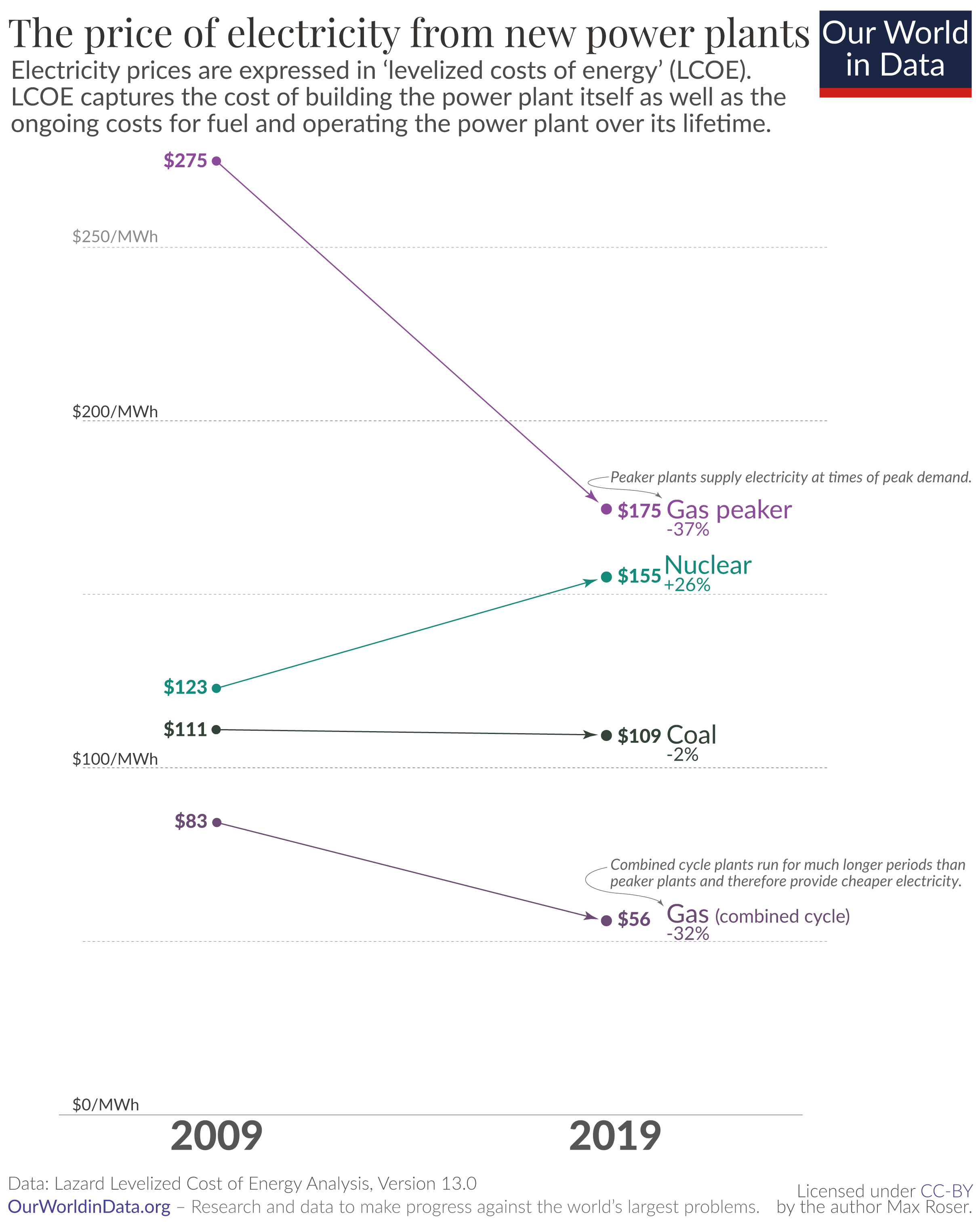
The chart here shows how the electricity prices from the long-standing sources of power – fossil fuels and nuclear – have changed over the last decade. The data is published by Lazard.4
To make comparisons on a consistent basis, energy prices are expressed in ‘levelized costs of energy’ (LCOE). You can think of LCOE from the perspective of someone who is considering building a power plant. If you are in that situation then the LCOE is the answer to the following question: What would be the minimum price that my customers would need to pay so that the power plant would break even over its lifetime?
LCOE captures the cost of building the power plant itself as well as the ongoing costs for fuel and operating the power plant over its lifetime. It however does not take into account costs and benefits at an energy system level: such as price reductions due to low-carbon generation and higher systemic costs when storage or backup power is needed due to the variable output of renewable sources – we will return to the aspect of storage costs later.5
This makes clear that it is a very crucial metric. If you as the power plant builder pick an energy source that has an LCOE that is higher than the price of the alternatives you will struggle to find someone who is willing to buy your expensive electricity.
What you see in the chart is that within the last 10 years the price of electricity from nuclear became more expensive, gas power became less expensive, and the price of coal power – the world’s largest source of electricity – stayed almost the same. Later we will see what is behind these price changes.
The price decline of electricity from renewable sources
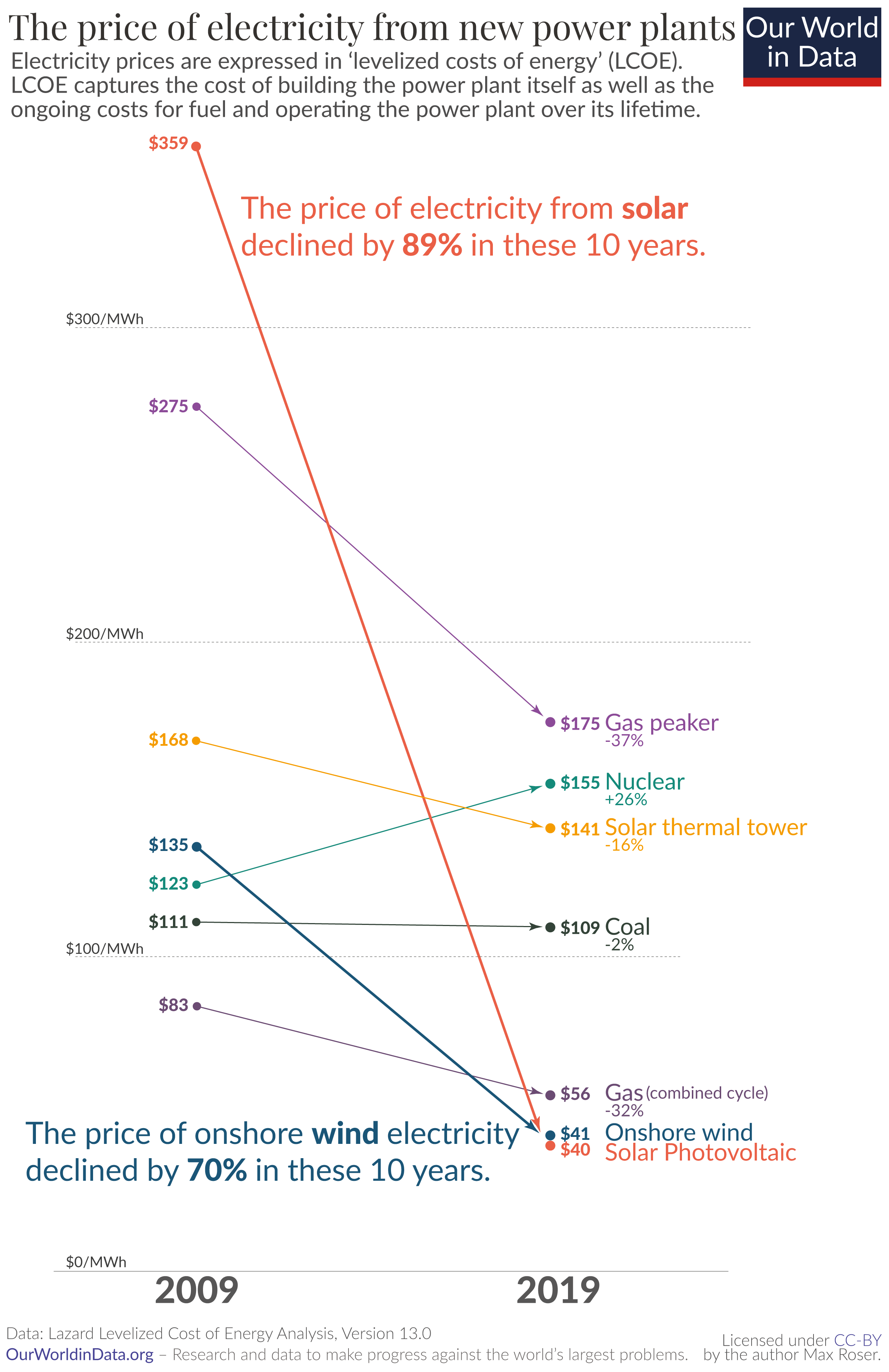
If we want to transition to renewables, it is their price relative to fossil fuels that matters.6 This chart here is identical to the previous one, but now also includes the price of electricity from renewable sources.
All of these prices – renewables as well as fossil fuels – are without subsidies.
Look at the change in solar and wind energy in recent years. Just 10 years ago it wasn’t even close: it was much cheaper to build a new power plant that burns fossil fuels than to build a new solar photovoltaic (PV) or wind plant. Wind was 22%, and solar 223% more expensive than coal.
But in the last few years this has changed entirely.
Electricity from utility-scale solar photovoltaics cost $359 per MWh in 2009. Within just one decade the price declined by 89% and the relative price flipped: the electricity price that you need to charge to break even with the new average coal plant is now much higher than what you can offer your customers when you build a wind or solar plant.
It’s hard to overstate what a rare achievement these rapid price changes represent. Imagine if some other good had fallen in price as rapidly as renewable electricity: Imagine you’d found a great place to live back in 2009 and at the time you thought it’d be worth paying $3590 in rent for it. If housing had then seen the price decline that we’ve seen for solar it would have meant that by 2019 you’d pay just $400 for the same place.7
I emphasized that it is the relative price that matters for the decision of which type of power plants are built. Did the price decline of renewables matter for the decisions of actual power plant builders in recent years? Yes it did. As you see in our Energy Explorer, wind and solar energy were scaled up rapidly in recent years; in 2019 renewables accounted for 72% of all new capacity additions worldwide.8
Why is this happening? Learning curves and the price of solar photovoltaics modules
How can this be? Why do we see the cost of renewable energy decline so very fast?
The costs of fossil fuels and nuclear power depend largely on two factors, the price of the fuel that they burn and the power plant’s operating costs.9 Renewable energy plants are different: their operating costs are comparatively low and they don’t have to pay for any fuel; their fuel doesn’t have to be dug out of the ground, their fuel – the wind and sunlight – comes to them. What is determining the cost of renewable power is the cost of the power plant, the cost of the technology itself.
To understand why solar power got so cheap we have to understand why solar technology got cheap. For this, let’s go back in time for a moment.
The first price point for usable solar technology that I can find is from the year 1956. At that time the cost of just one watt of solar photovoltaic capacity was $1,865 (adjusted for inflation and in 2019 prices).10 One watt isn’t much. Today one single solar panel of the type homeowners put on their roofs produces around 320 watts of power.11 This means that at the price of 1956 one of today’s solar modules would cost $596,800.12
At this price – more than half a million dollars for a single panel – solar was obviously hopelessly uncompetitive with fossil fuels.
Then why didn’t the history of solar technology end right there?
There are two reasons why instead of dying, solar has developed to become the world’s cheapest source of electricity today.
Even at the very high price, solar technology did find a use. It is a technology that literally came from outer space. The very first practical use of solar power was to supply electricity for a satellite, the Vanguard I satellite in 1958. It was in this high-tech niche where someone was willing to pay for solar technology even at that extremely high price.
The second important reason is that the price of solar modules declined when more of them were produced. More production gave us the chance to learn how to improve the production process: a classic case of learning-by-doing. The initial demand in the high-tech sector meant that some solar technology was produced and this initial production started a virtuous cycle of increasing demand and falling prices.
The visualization shows this mechanism. To satisfy increasing demand more solar modules get deployed, which leads to falling prices; at those lower prices the technology becomes cost-effective in new applications, which in turn means that demand increases. In this positive feedback loop solar technology has powered itself forward ever since its early days in outer space.
A short history of solar: From outer space to the cheapest source of energy on earth
During the 1960s the main application of solar remained in satellites. But the virtuous cycle was set in motion and this meant that slowly, but steadily, the price of solar modules declined.
With falling prices the technology came down from space to our planet. The first terrestrial applications in the 1970s were in remote locations where the connection to the wider electrical grid is costly – lighthouses, remote railroad crossings, or the refrigeration of vaccines.13
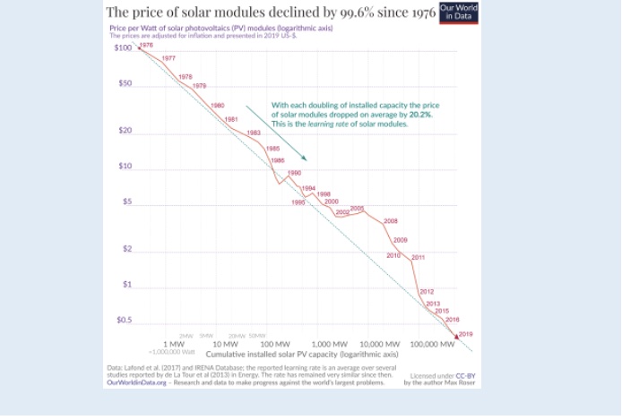
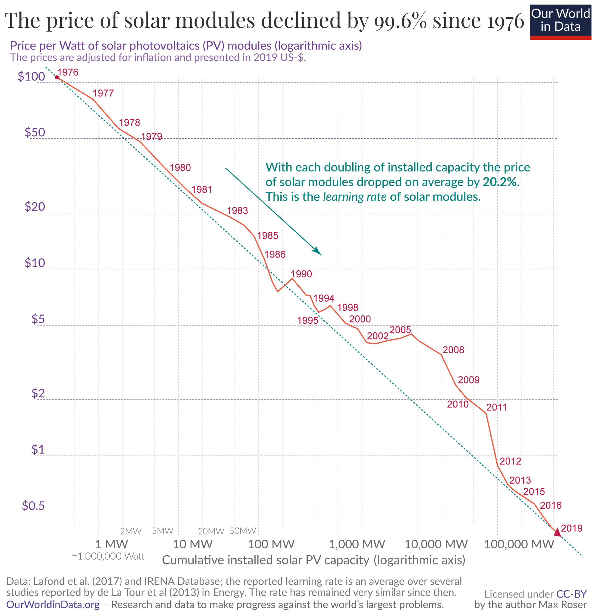
The data point for 1976 in the top left corner of the chart shows the state of solar technology at the time.
Back then the price of a solar module, adjusted for inflation, was US-$106 per watt. And as you see on the bottom axis, global installed solar PV capacity was only 0.3 megawatts. Relative to 1956 this was already a price decline of 94%, but relative to the world’s energy demand solar was still very expensive and therefore very small: a capacity of 0.3 megawatts is enough to provide electricity for about 20 people per year.14
The time-series in the chart shows how the price of solar modules changed from then until now. The so-called ‘learning effect’ in solar technology is incredibly strong: while the installed capacity increased exponentially, the price of solar modules declined exponentially. The fact that both metrics changed exponentially can be nicely seen in this chart because both axes are logarithmic. On a logarithmic axis a measure that declines exponentially follows a straight line.
This straight line that represents the relationship between experience – measured as the cumulative installed capacity of the technology – and the price of that technology is called the learning curve of that technology. The relative price decline associated with each doubling of experience is the learning rate of a technology.
This is the virtuous cycle in action. More deployment means falling prices, which means more deployment. With solar technology it was for a long time the case that its increased deployment was made possible through government subsidies and mandates – arguably the most positive effect of these policies is that they too drove down the price of these new technologies along the learning curve. Paying for renewables at a high price point earlier allows everyone to pay less for them later.
That more production leads to falling prices is not surprising – such ‘economies of scale’ are found in many corners of manufacturing. If you are already making one pizza, it isn’t that much extra work to make a second one.
What is truly mind blowing about solar technology is how very strong this effect is: For more than four decades each doubling of global cumulative capacity was associated with the same relative decline in prices.
The advances that made this price reduction possible span the entire production process of solar modules:15 larger, more efficient factories are producing the modules; R&D efforts increase; technological advances increase the efficiency of the panels; engineering advances improve the production processes of the silicon ingots and wafers; the mining and processing of the raw materials increases in scale and becomes cheaper; operational experience accumulates; the modules are more durable and live longer; market competition ensures that profits are low; and capital costs for the production decline. It is a myriad of small improvements across a large collective process that drives this continuous price decline.
The learning rate of solar PV modules is 20.2%.16 With each doubling of the installed cumulative capacity the price of solar modules declines by 20.2%.17 The high learning rate meant that the core technology of solar electricity declined rapidly. The price of solar modules declined from $106 to $0.38 per watt. A decline of 99.6%.
To get our expectations for the future right we ought to pay a lot of attention to those technologies that follow learning curves. Initially we might only find them on a high-tech satellite out in space, but the future belongs to them. Renewable energy sources are not the only case; the most well-known case is the computer and the corresponding historical development there is ‘Moore’s Law’. If you are interested in getting your expectations about the future right, you are interested in how Moore’s Law helps us to see the future of technological development, and you want to know about whether it is indeed the case that scaled-up production causes declining prices you can read the following information box that takes a deeper look at it.
How Moore’s Law and Wright’s Law can help us to get our expectations for the future right
Do electricity prices follow learning curves?
Solar PV modules might very well follow a rapidly declining learning curve, but solar modules themselves are not what we want. We want the electricity that they produce. Does the price of solar electricity follow a learning curve?
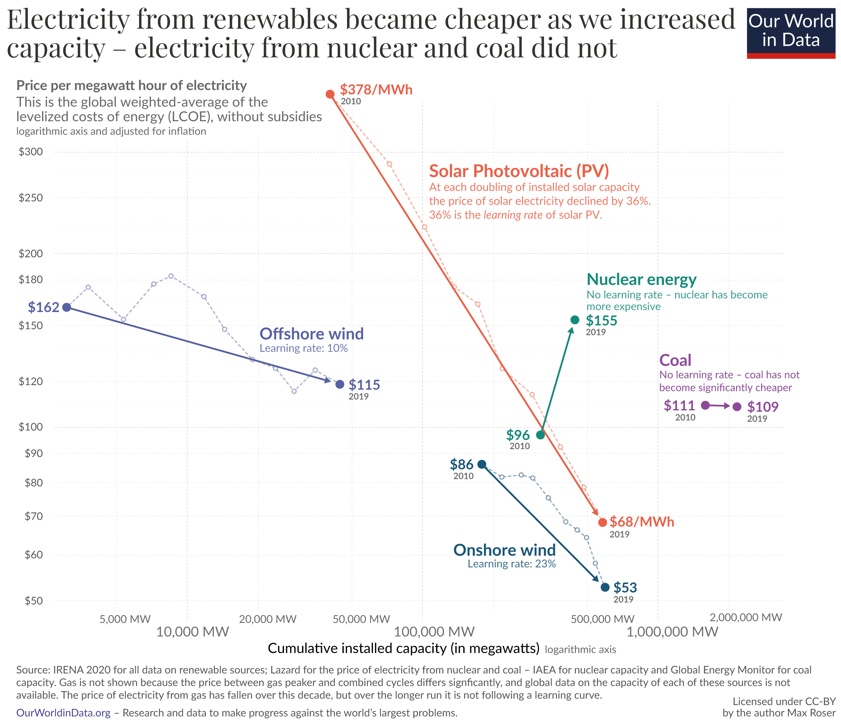
The visualization shows the relevant data.24 On the vertical axis you see again the LCOE price for electricity and on the horizontal axis you now find the cumulative installed capacity.25 As in the solar module chart, both variables are plotted on logarithmic scales so that the line on the charts represents the learning rate for these technologies.
In bright orange you see the development for the price of power from solar PV over the last decade. The learning curve relationship that we saw for the price of solar modules also holds for the price of electricity. The learning rate is actually even faster: At each doubling of installed solar capacity the price of solar electricity declined by 36% – compared to 20% for solar modules.
Wind power – shown in blue – also follows a learning curve. The onshore wind industry achieved a learning rate of 23%. Every doubling of capacity was associated with a price decline of almost a quarter.
Offshore wind had a learning rate of 10% and is still relatively expensive – only 25% cheaper than nuclear and a bit more expensive than coal. But for two reasons experts expect the power from offshore wind to become very cheap in the coming years, larger wind turbine sizes and the fact that the consistent winds out on the sea allows higher load factors.26 The obvious similarity of onshore and offshore wind also means that learning effects in one industry can be transferred to the other.
Fossil fuels and nuclear do not follow learning curves
Electricity generation from renewables is getting rapidly cheaper. What about its competitors? Let’s look first at coal.
Why is electricity from coal not getting cheaper?
Coal, the world’s largest source of electricity, is also included in the chart. The global price of electricity from new coal (LCOE) declined from $111 to $109. While solar got 89% cheaper and wind 70%, the price of electricity from coal declined by merely 2%.
The stagnating price of coal power in the last decade is not unusual. The historical development of the price of coal power is nowhere close to what we’ve been seeing for renewable power. Neither the price of the coal nor the price of the coal plants followed a learning curve, the prices didn’t even decline over the long run.27
Electricity from coal was historically cheap and still is, but it is not getting cheaper. There are two reasons we shouldn’t expect this to change much in the future:
First, there is little room for improving the efficiency of coal power plants substantially. Typical plants have efficiencies of around 33%, while the most efficient ones today reach 47%.28 Even a dramatic, unprecedented improvement from an efficiency of one-third to two-thirds would only correspond to the progress that solar PV modules make every 7.5 years.29
Second, the price of electricity from all fossil fuel is not only determined by the technology but to a significant extent by the cost of the fuel itself. The cost of coal that the power plant burns makes up about 40% of total costs.30This means that for all non-renewable power plants which have these fuel costs there is a hard lower bound to how much the cost of their electricity can possibly decrease. Even if the price for constructing the power plant would decline, the price of the fuel means that there is a floor below which the price of electricity cannot pass.
For these reasons it should not be surprising that coal power does not follow a learning curve.
Electricity from gas: should we expect that the price continues to fall?
Electricity from gas, the second largest fossil fuel source, did become cheaper over the last decade.31 As we saw above, electricity from combined cycle gas plants declined by 32% to a global average cost of $56 per MWh.32
The costs of building a gas plant declined during some periods in the last 70 years, as Rubin et al (2015) show.33 But the main reason the price of gas electricity declined over the last decade is that the price of gas itself happened to decline over this particular period. After a peak in 2008 the price of gas declined steeply. The increased supply from fracking is one key reason. This price decline of gas, however, is not part of a long-run development. The price of gas today is higher than two or three decades ago.
For the same reasons as discussed for coal – limited learning and fuel costs as a floor – we should therefore not expect the price of electricity from gas to decline significantly over the coming decades and we should certainly not expect a learning curve effect similar to what we are seeing for renewables.
Why did nuclear power get more expensive? What can reverse that trend?
For nuclear power you see the data since 2009 in the chart. Nuclear power has increased in price.
This increase is part of a longer term trend. In many places building a power plant has become more expensive as the studies reviewed in Rubin et al (2015) document.34 This is of course very unfortunate, since nuclear is both a low-carbon source of electricity and one of the safest sources of electricity as we have seen in the very first chart.
One reason for rising prices is increased regulation for nuclear power, which has the important benefit of increased safety. A second reason is that the world has not built many nuclear power plants in recent years so that supply chains are small, uncompetitive, and are not benefiting from economies of scale.35
Both of these reasons explain why the global average LCOE price has gone up. But for nuclear there are large differences in price trends between countries: Prices and construction times have increased significantly in the US and the UK, while France and South Korea were at least able to keep prices and construction times constant.36
Michel Berthélemy and Lina Escobar Rangel (2015) explain that those countries that were able to avoid price surges are countries that do not stand out in regulating nuclear power less, but in standardizing the construction of reactors more.37 Learning, after all, means transferring the knowledge gathered in one instance to another. No repetition, no learning.
This is in sharp contrast with renewables in particular. While nuclear technology is not very standardized and gets build very rarely, solar PV modules and wind plants are the exact opposite, very standardized and extremely often built.38
One hope is that a new boom in nuclear power and increased standardization of the reactors would lead to declining costs of nuclear power.
But there is no strong price decline anywhere, and certainly nothing that could be characterized by a steep learning curve.
But nuclear could still become more important in the future because it can complement renewables where these energy sources have their weaknesses: First, intermittency of electricity from renewables remains a challenge and a viable energy mix of the future post-carbon world will likely include all low-carbon sources, renewables as well as nuclear power. And second, the land use of renewables is large and a big environmental benefit of nuclear power is that it uses very little land.39
And beyond the existing nuclear fission reactors there are several teams working towards nuclear fusion reactors, which would potentially entirely change the world’s energy supply.40
To make nuclear reactors competitive with fossil fuels is again an argument for carbon taxes. Nuclear reactors kill 350-times less people per unit of energy than fossil fuel plants, and as a low-carbon technology they can be key in making the transition away from fossil fuels.
Batteries and electricity storage follow learning curves too
One of the downsides of renewable sources is their intermittent supply cycle. The sun doesn’t always shine and the wind doesn’t always blow. Technologies like batteries that store electric power are key to balance the changing supply from renewables with the inflexible demand for electricity.
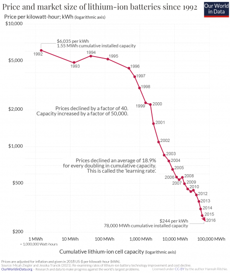
Fortunately electricity storage technologies are also among the few technologies that are following learning curves – their learning curve are indeed very steep, as the chart here shows.
This chart is from my colleague Hannah Ritchie; she documents in her article that the price of batteries declined by 97% in the last three decades.41
At their current price there might only be demand for five large power storage systems in the world, but as a prediction for the future this might sound foolish one day (if you don’t know what I’m alluding to, you skipped reading the text in the fold-out box above).
Scaling up low-carbon sources leads to lower prices; let’s not waste this opportunity for our planet and economy
The takeaway of the previous discussion is that renewables follow steep learning curves and fossil fuels do not. A key reason is that renewables do not have fuel costs and comparatively small operating and maintenance costs, which means that the LCOE of renewable energy scales with the cost of their technologies. And the key technologies of renewable energy systems – solar, wind, and batteries – themselves follow a learning curve: each doubling of their installed capacity leads to the same decline of costs.
If we are serious about making the transition to a low-carbon global energy system we have a fantastic opportunity in front of us. Scaling up renewable energy systems doesn’t only have the direct benefit of more low-carbon energy, but has an indirect side effect that is even more important: cheaper energy.
The learning rates for wind and solar PV are exceptionally fast. It is extremely rare to find technologies of this kind.
Solar and wind have one more big advantage. While there is often little agreement in how to reduce greenhouse gas emissions, expanding solar and wind power are two options that are hugely popular with large majorities. Even in the often polarized US, renewables have the support of strong majorities of Democrats and Republicans. 85% of Americans are in favour of expanding wind power and 92% are in favor of expanding solar power, and in other countries the support is often even higher.42
Today, at a time when the global economy – and workers around the world – suffer greatly from the COVID-19 recession and when interest rates are low (or even negative), scaling up renewable energy systems offers us a great chance to move forward. It is rare to have a policy option that leads to more jobs, cheaper prices for consumers, and a greener, safer planet.43
The more renewable energy technologies we deploy, the more their costs will fall. More growth will mean even more growth.
Making renewable energy irresistible: Technological progress somewhere turns into progress everywhere
One last argument on why lower prices due to technological change are so crucial for making the transition to the post-carbon world. If rich countries make investments into renewable technology that drive down the price along the learning curves, they are not just working towards the transition from fossil fuels to renewable energy for themselves, but for the entire world.
The relative price of fossil fuels and renewables is key to anyone’s decision of which power plant to build. Making low-carbon technology cheap is a policy goal that doesn’t only reduce emissions in your own country but in the entire world, forever.
Driving down the price of low-carbon energy should be seen as one of the most important goals (and achievements) of clean energy policy, because it matters beyond the borders of the country that is adopting that policy. This is the beautiful thing about technology: once it is invented somewhere it can help everywhere.
The biggest growth in electricity demand in the coming years will not come from rich countries, but the poorer, yet rapidly developing countries in Africa and Asia.44 The steep decline of solar power is a particularly fortunate development for many of these countries that often have sunny climates.
Energy systems have very long path dependencies, since it is very costly to build a power plant or to decide to shut a power plant down. Investments in renewable technologies now will therefore have very long-term benefits. Every instance when a country or an electricity company decides to build a low-carbon power plant instead of a coal plant is a win for decades. Low prices are the key argument to convince the world – especially those places that have the least money – to build low-carbon power systems for a sustainable future.
Conclusion
One of the very worst misconceptions about the challenge of climate change is that it is an easy problem to solve. It is not.
Climate policy is exceedingly difficult45 and the technological challenges are much larger than the electricity sector alone since it is only one of several big sectors that need to be decarbonized. We need change and technological innovation across all these sectors at a scale that matches the problem and the problem is big.
But what the consideration of changing electricity prices has shown is that we have a clear option in front of us where we are able to make very important progress. Low-carbon technologies that were so expensive just a few decades ago that they were only affordable for satellites have came down steadily in price and now provide the cheapest electricity on the planet (which implies that they are now the cheapest source of energy that humanity ever had access to).
Driving down the costs of renewables is key to a green, low-carbon future, but it also has a big benefit for people today: Your real income is the ratio between what you are paid and the price of the goods and services you pay for – that is why falling energy prices means that people’s real income is growing. Falling energy prices means economic growth and less poverty.
The reason we can hope for a future in which renewables are deployed rapidly and where fossil fuel plants become increasingly unprofitable is that renewables follow steep learning curves, and fossil fuels do not. We are heading towards a future in which the disadvantage of fossil fuels will keep increasing.
But limiting climate change is a race against time and we have a long way to go. There is a good chance that the world has reached the peak of greenhouse gas emissions last year. A huge milestone, but the peak is not the goal; we need to get all the way down to net-zero.
The argument for scaling these technologies up sooner rather than later is that we are getting to the low-carbon, low-cost future faster. This ensures that the power plants that will be built in the coming years are not fossil fuel plants but renewables.
This is key to bringing down greenhouse gas emissions fast. And it has the side effects that it saves people from air pollution and it reduces energy prices – which means growing incomes and declining poverty.
→ If you want to be informed when new posts are out you can sign up to our newsletter.
Acknowledgements: I would like to thank Hannah Ritchie, François Lafond, Rupert Way, Marcel Gerber, Ernst van Woerden, Charlie Giattino, and Breck Yunits for reading drafts of this and for their very helpful comments and ideas.
Citation
Our articles and data visualizations rely on work from many different people and organizations. When citing this article, please also cite the underlying data sources. This page – and all of our linked articles and resources on this topic – should be cited as:
How to cite
Hannah Ritchie and Max Roser (2021) – Energy. Published in Our World in Data. Online at: ourworldindata.org/energy

